Your Summer Camp Marketing Depends on Photos That Tell the RIGHT Story
Here's a list of great summer camp marketing photos you need to make sure happen this summer.
First: There are Photo's that don't sell camp
1. It's important to remember that new-to-our-camp families don't have an emotional connection to the "place" of camp.
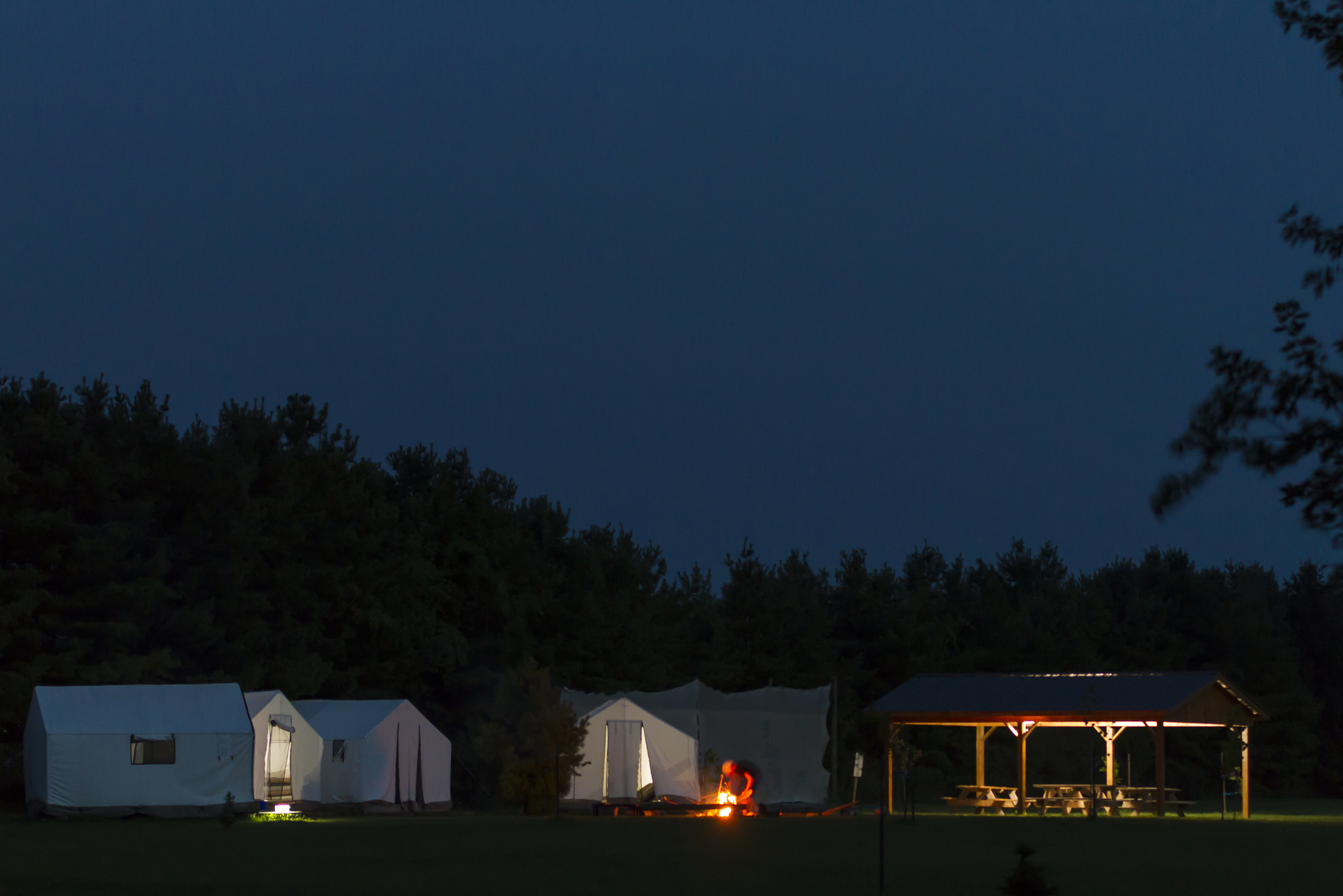
Showing your beautiful lodge at sunset inspires a strong response from alumni and current campers and staff. They've had some very impactful moments in that place and just seeing it in a certain light will make them smile, or cry, or even swear they can almost smell that place you're showing.
New families ask themselves "Do they want to sell me real estate?!?"
2. Photos that look like could come from anywhere (even a stock photo site).
90% of the camp websites I look at have some version of this photo: 3 kids in lifejackets, each of a different ethnic background, hugging and smiling at the camera.
I get it. I do. (but so do all the other Camp Pros who are showing the same thing)
Show pictures that are uniquely yours.
Collect 2 or 3 varieties of each of these following photos and you will have all the tools you need to sell camp for next season
1. Professional Headshots of ALL of your year-round staff (not just the director). These should be taken in the shade, with the subject standing , not sitting. Don't forget to "turtle" - see this Peter Hurley video below.
1.5 If your year-round staff is at camp with their family - get pro photos of them together at camp. It's easier for parents to trust an organization that is run by people who know what their life is like (i.e. parents). Let's show them that.
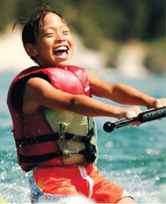
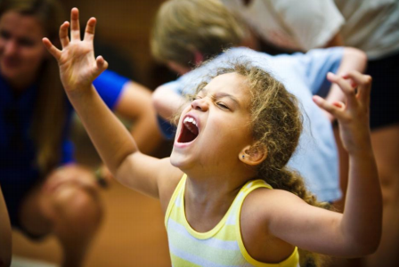
2. "Pictures of happy customers using your product". Donald Miller from Storybrand.com says that, at it's heart, this is all you need to show. I think he's quite right. Joanna Warren Smith as talked, on this blog about these two photos - the best she's ever seen: "Sammy's pride of accomplishment and Jenna's total engagement. "
3. Kids and camp counsellors interacting. Smiles are important here but not essential. Just focus on the moments when staff are paying attention to one child. We know from interviewing camp parents that one of their big concerns about summer camp is that their child will "disappear" in to the crowd. These pictures will help show that each kid has a special place at your camp.
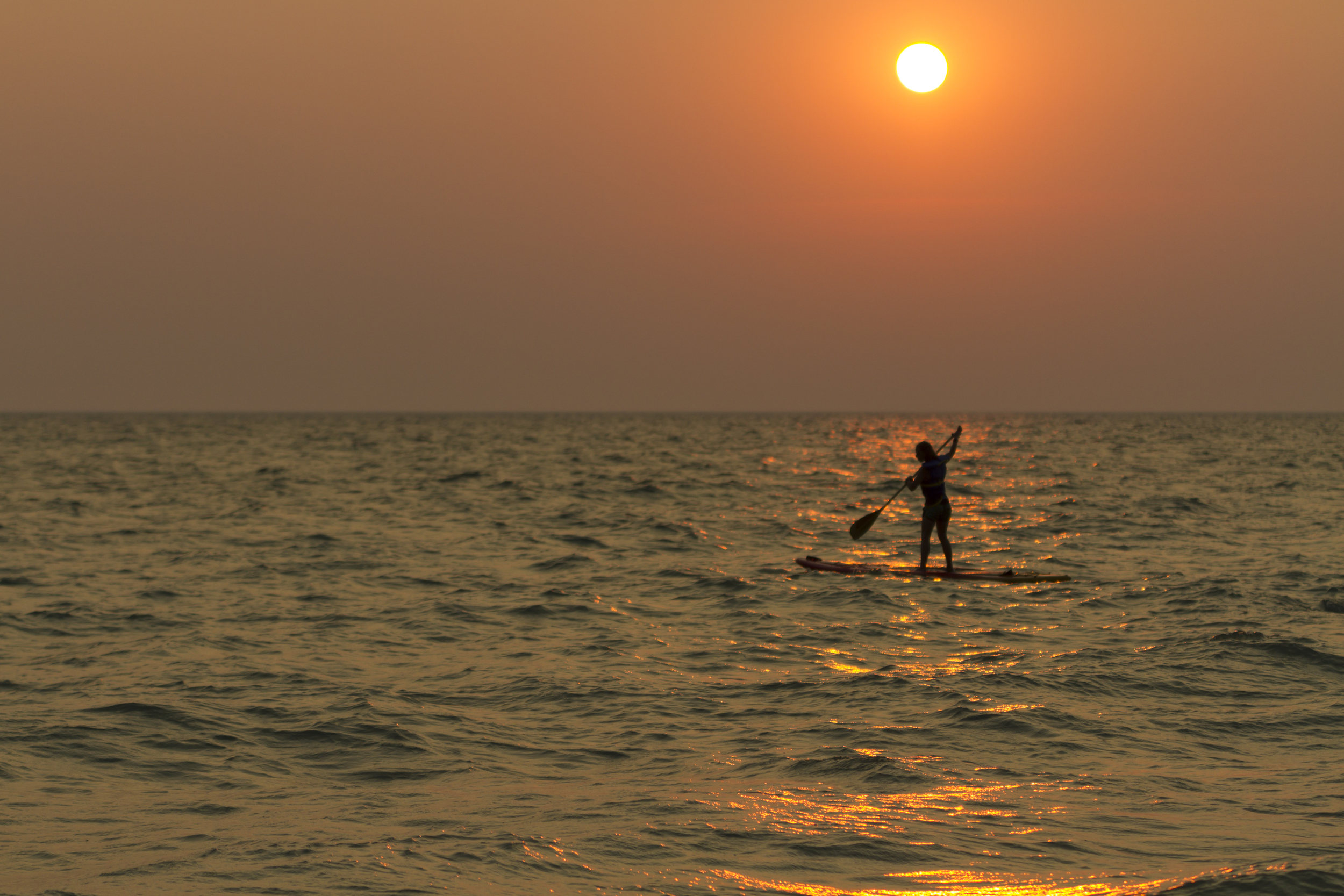
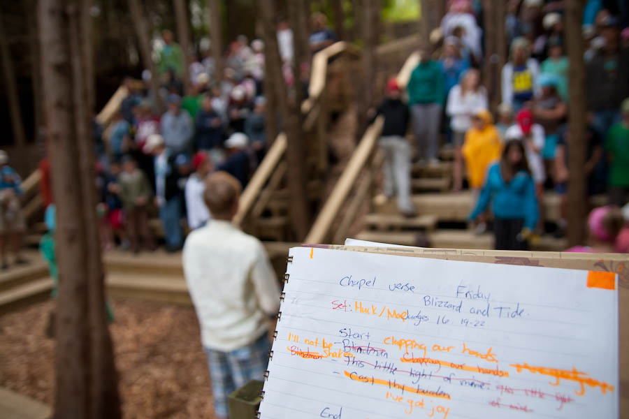
4. The Beginning of the Day Whether you are at a day camp or an overnight camp, the start of the day has lots of great little moments - kids being greeted getting off the bus, going do to the lake for Polar Dip, singing as they come up for breakfast. Plus: your light will be SOOOOO much better than in the middle of the day.
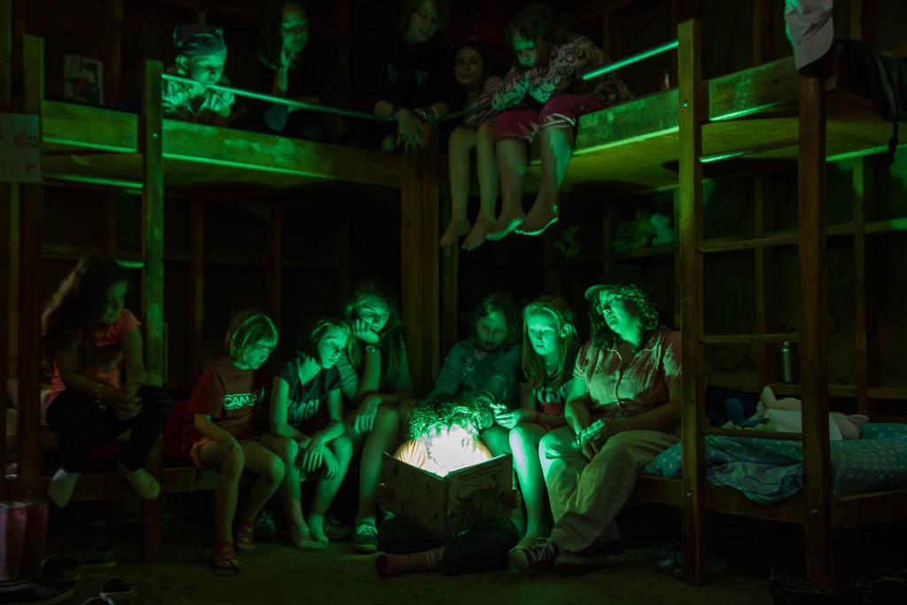
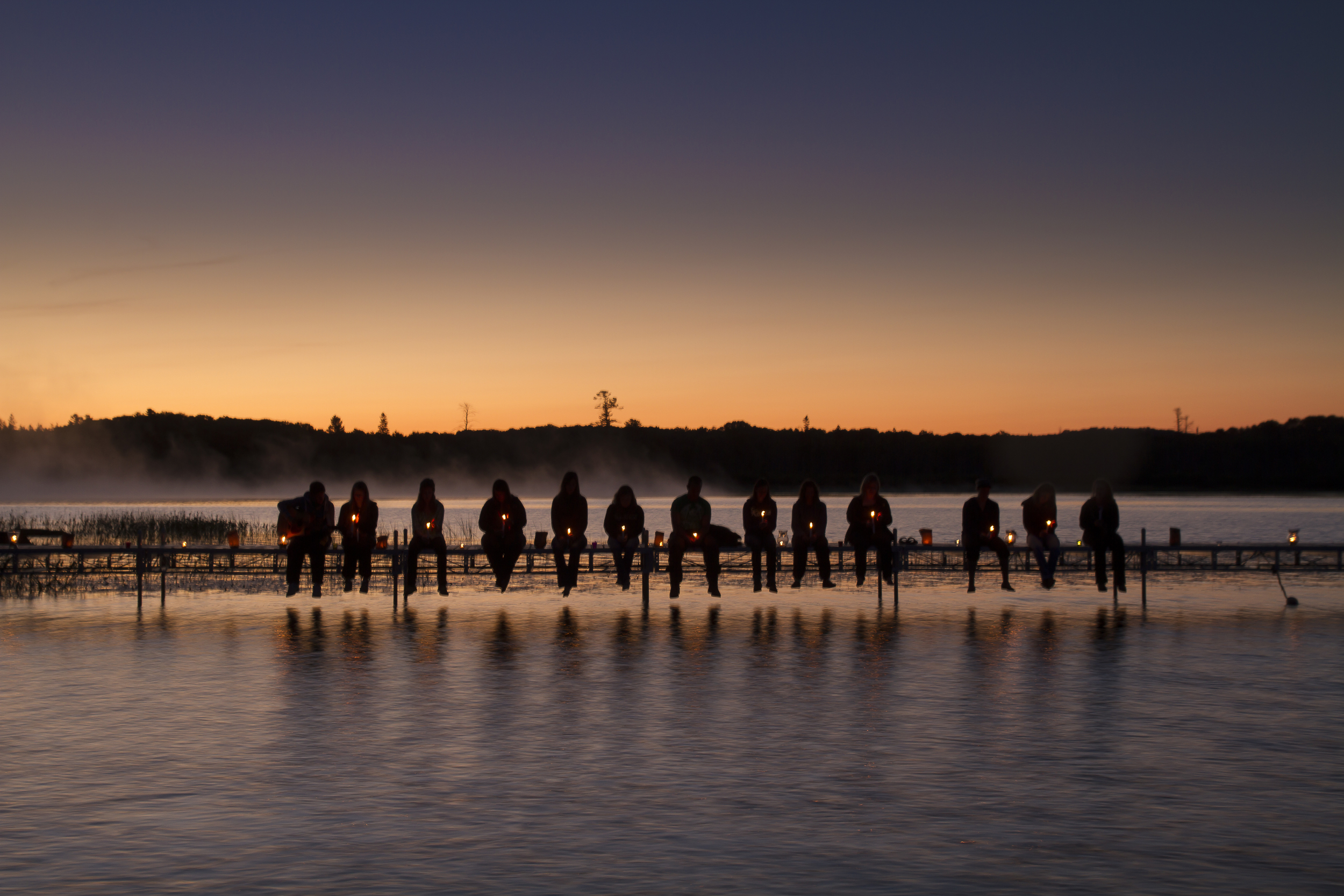
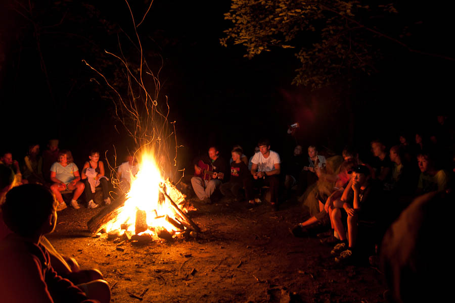
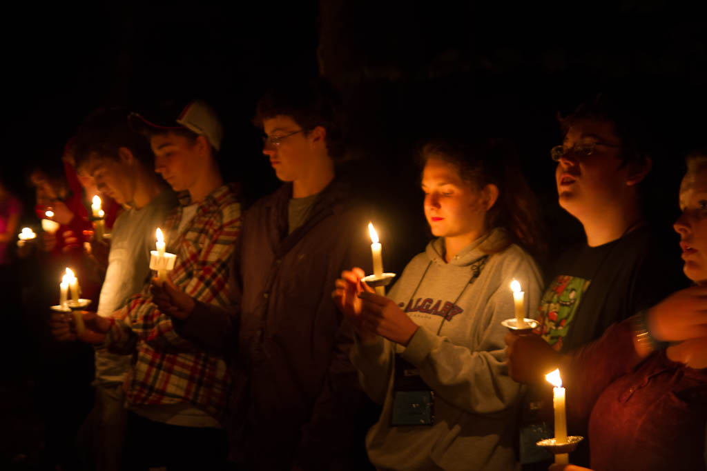
5. The End of the Day I call these the "shoulders" of the day. They are times when things become emotionally stronger (singing together around a fire, crying because you don't want to get in the car and go home) at summer camp. I really feel that this is where camp goes from mundane to extraordinary. The end of the day can include quiet times in the cabin or a day camp's flag ceremony.
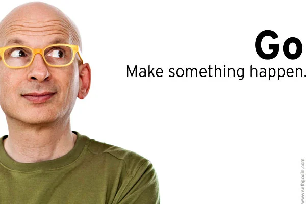
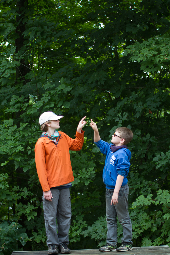
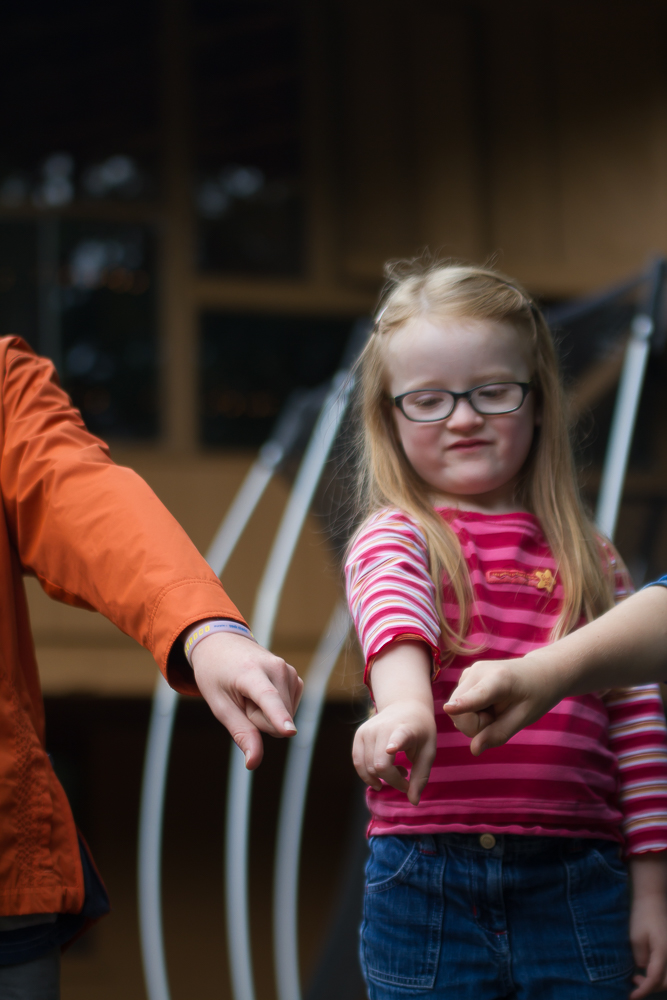
6. Campers and Staff Shots for Marketing I'm sure you've seen these pictures (if not you'll start to notice them now!): a person, probably a client, maybe a representative of the organization is photographed on the edge of a picture looking "into" the frame. These shots are WONDERFUL for marketing because they take advantage of an interesting piece of human psychology - we always follow the eyes. If someone is looking to the right, we want to look there, too.
One of my favourite examples is this picture of (Camp Arowhon alumn) Seth Godin - he and his team use it all the time and it never fails to get me to look where he's looking.
Some things to remember:
- make sure the background is simple - it doesn't have to be studio-white like Seth's but it should be be plain, with no strong lines (from tree trunks, docks, edges of buildings, etc.)
- do what you need to to make them happy - one of the most intriguing things about Godin's photo is that little grin. It makes us stop and wonder "what's going on there?"
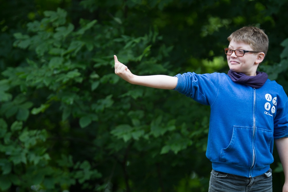
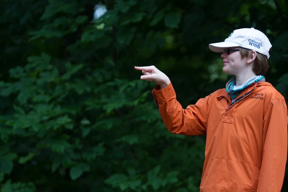
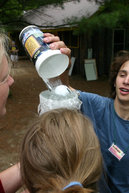
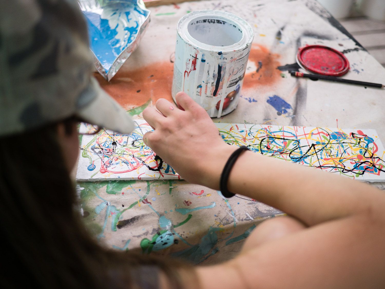
Here's a couple of photos that I took for some CampHacker marketing projects so you can see what I'm thinking of. All of these pictures include the kids pointing but I think you should concentrate on just looking to the left, right and up.
The fourth image Does Not work because of the distracting lines in the back ground.
7. Mom's Love Maslow Make sure that you have many great examples (hopefully with camper-staff interactions) around the basics: food - fresh, homemade and full of colour; accommodation - clean and full of light; safety - sunscreen, hats, proper shoes and life jackets.

